Internship @DiDi
Role
Brand design,
marketing design
Team
DiDi English Team
Timeline
May - Aug, 2020
Location
Beijing, China
Introduction
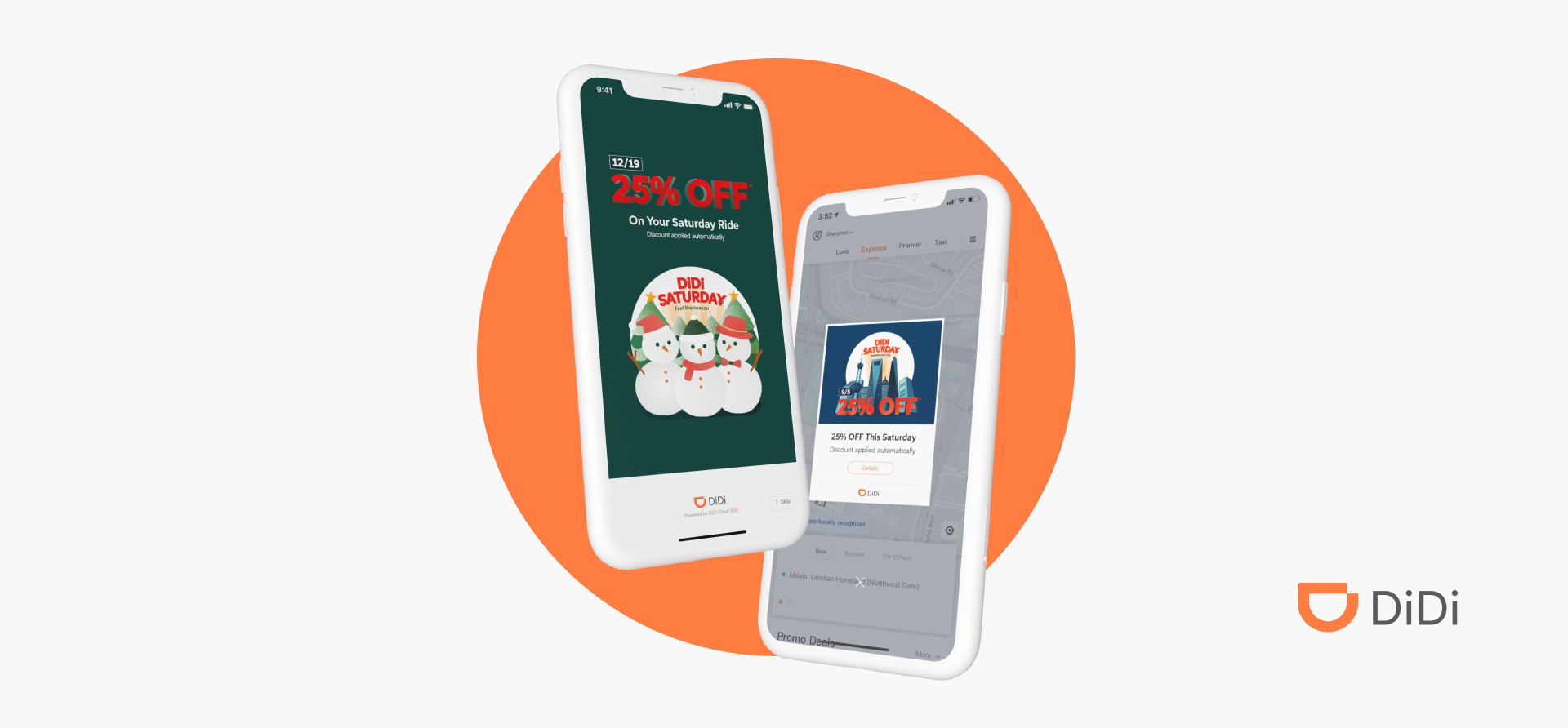
DiDi is the main ride-hailing app in China with over 550 million riders. I worked as the sole designer on the DiDi English team to design illustrations for the DiDi Saturday marketing campaign and an in-app marketing platform called Rewards Club.
Project highlights
DiDi Saturday Annual Campaign [Launched🚀]
DiDi Saturday is the largest annual marketing campaign for DiDi’s English version. Every Saturday, riders receive an automatic 25% discount on all rides. The goal is to incentivize riders to choose DiDi over other transportation options. This will be achieved through multi-channel marketing exposures, which will ultimately create a habit of booking DiDi rides and drive profit.
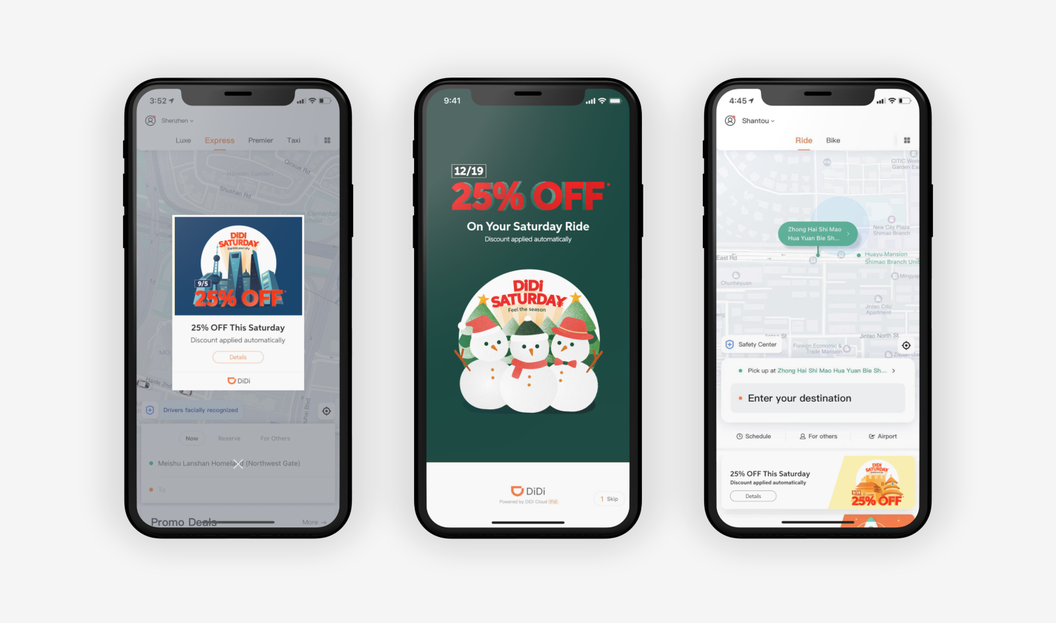
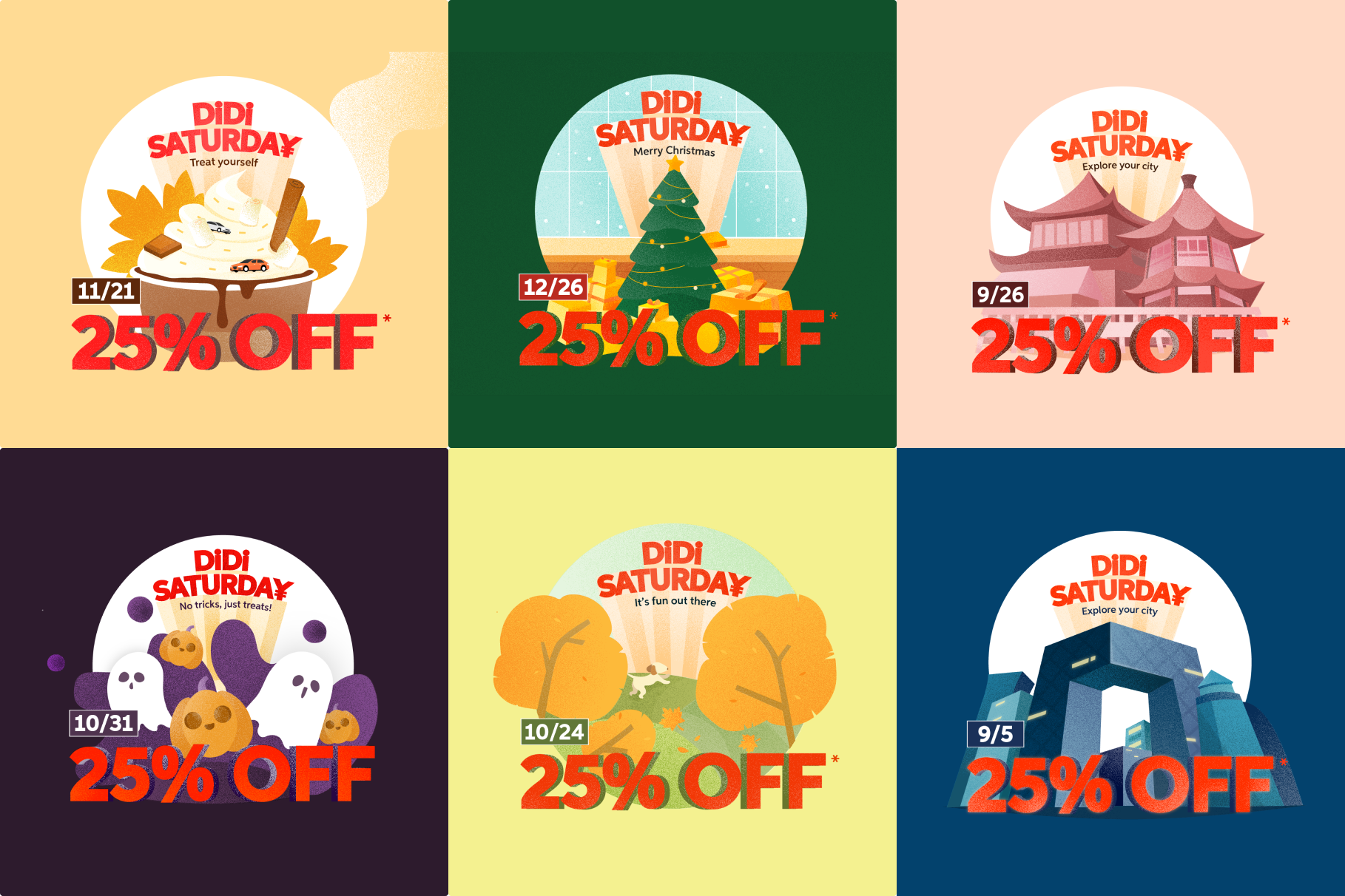
As the only designer on the marketing team, I created the campaign logo, key visuals, illustration library, and marketing assets for both in-app and social media marketing.
Rewards Club [Live in App]
The Rewards Club is an in-app rewards program that allows users to explore local deals. Partnered businesses would also display DiDi discounts on their platforms as a cross-marketing program. As part of my responsibilities, I designed the program logo, UI, and illustration library.
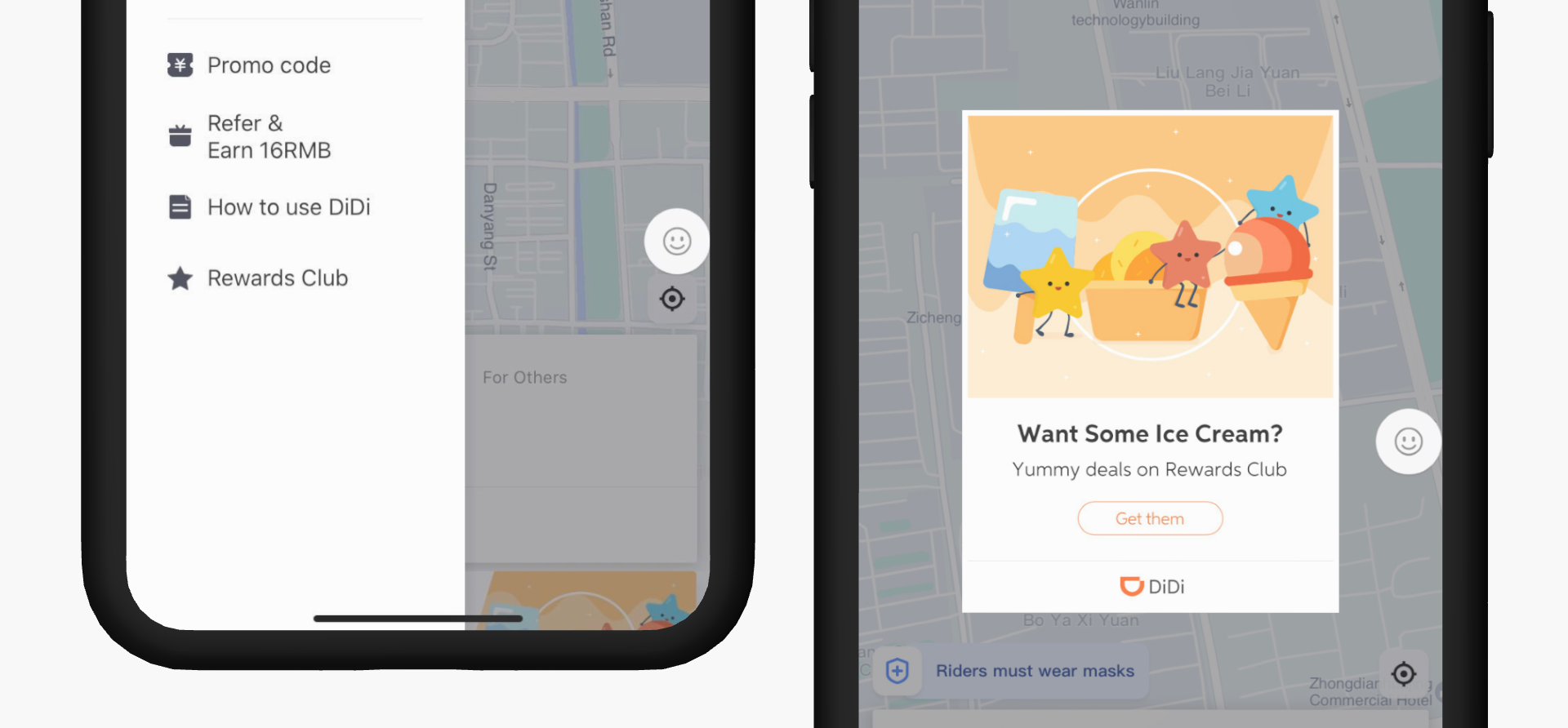
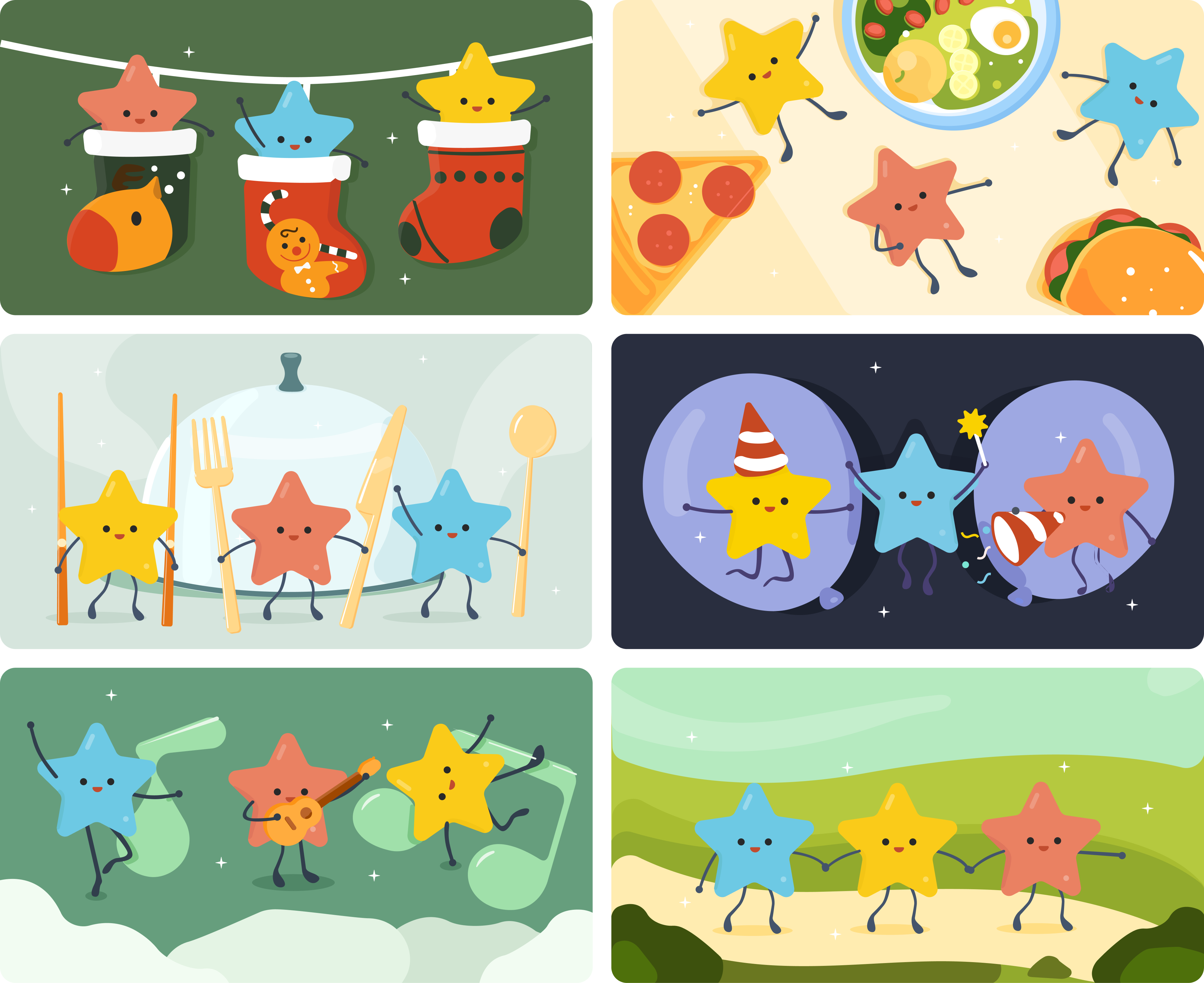
When brainstorming iconography to represent rewards, we settled on a star. The three stars represent the three parts of the program: DiDi, our business partners, and the users.
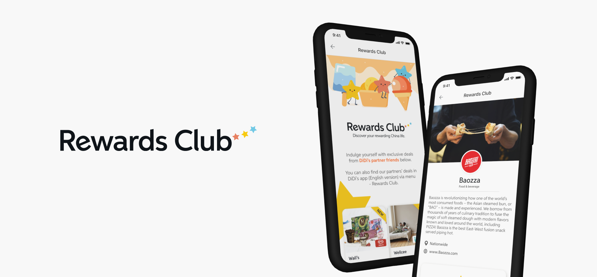
In addition to designing the platform, I had the opportunity to work directly with 12 partner businesses for the initial launch of the Rewards Club. This ensured that their brands were well-represented on Rewards Club and that the banner provided by DiDi aligned with their platform branding.
Here are some of the visual assets I designed:
Takeaways
Finding the balance between visual design and the message we are sending.
Although we want the visual design to catch users' attention, it is equally important that the design is not too “creative” that it distracts users from the primary promotional message.
Asking the why behind every element - simplicity is key.
Marketing design is not just about making things look pretty. It is essential to design with intention, paying attention to every element on the screen to ensure that the message does not get lost.
Talking to the users.
We had made many assumptions about the visual style that expats in China would prefer and neglected the fact that most of them are in China because they enjoy the local culture. Speaking with them allowed us to redefine our design goals to focus on the local culture, instead of simply imitating a style that we assumed Westerners would prefer.